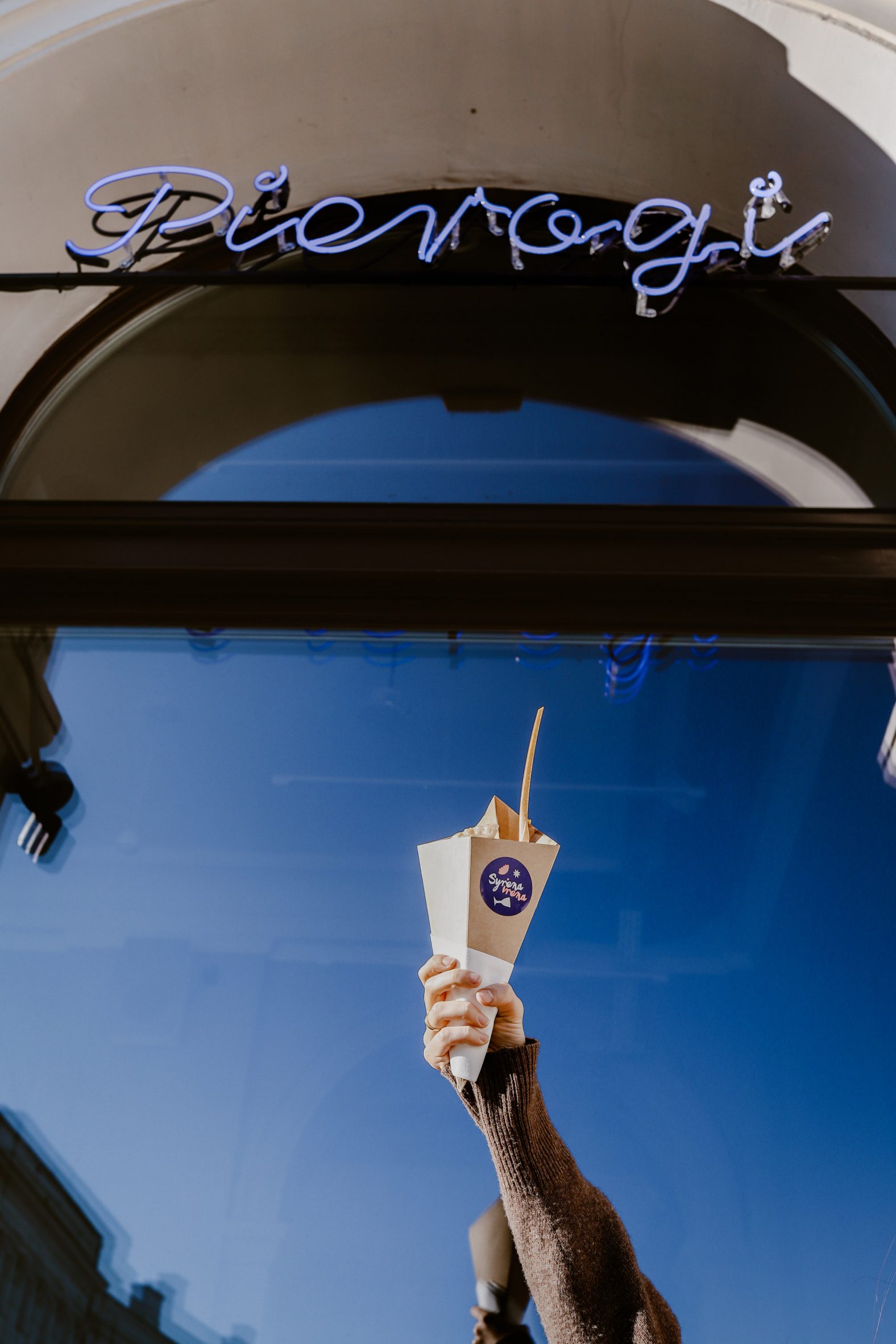
Polish architecture firm Projekt Praga has blended modern and mid-century features inside the Syrena Irena bistro in Warsaw, which serves traditional pierogi dumplings.
Syrena Irena is located in an early 1950s building in the centre of the city that originally functioned as a hotel cafe.
Aside from handmade boiled pierogi, the restaurant’s “cheerful and honest” menu contains classic Polish dishes from the 50s and 60s such as sour rye soup and herring in flax and hemp oil, which have been updated for modern tastes.
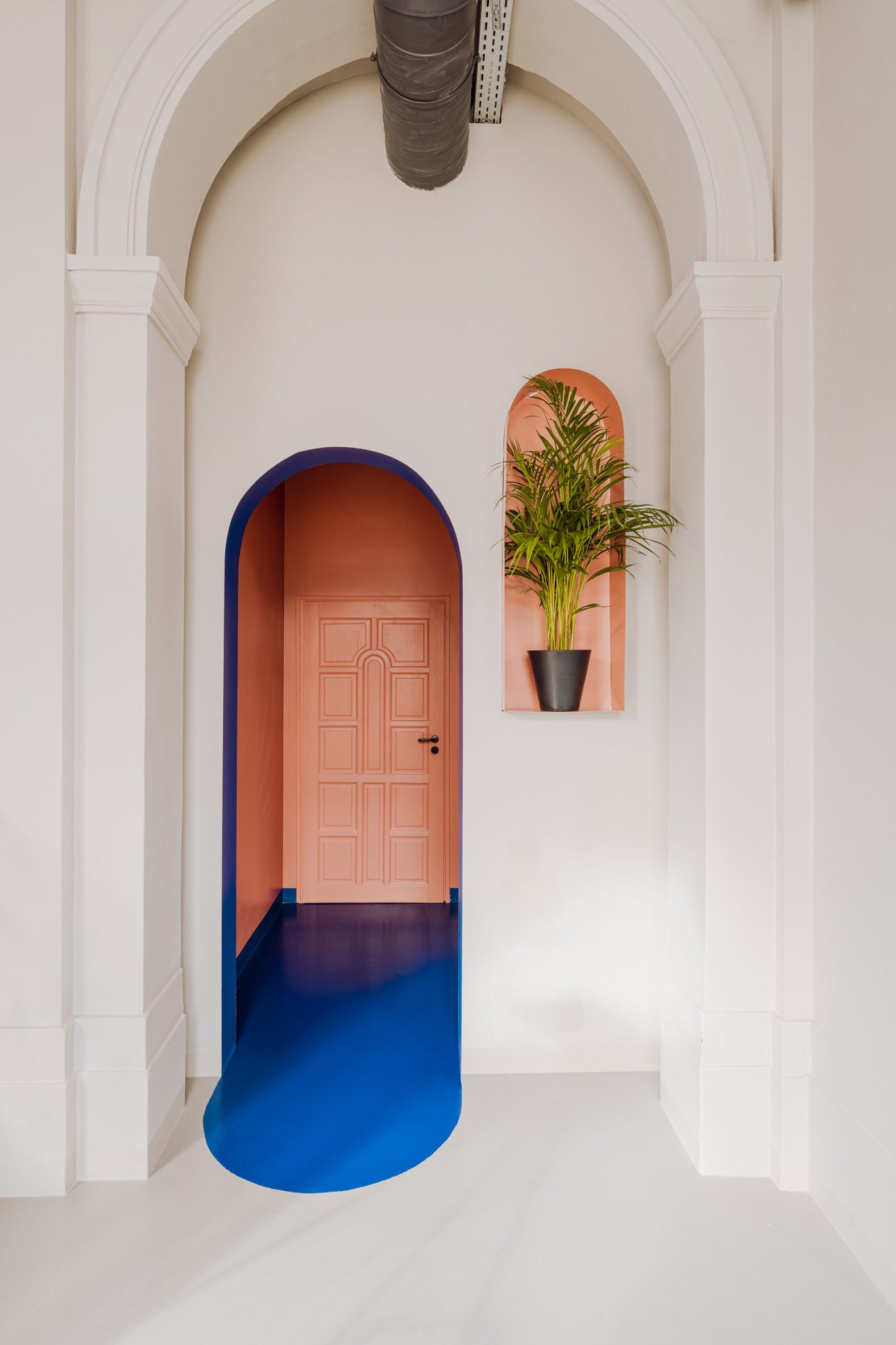
To add to the homely and casual atmosphere, Projekt Praga created an interior with a self-service set-up that uses mid-century design references to pay homage to both the building’s architecture and the bistro’s nostalgic menu.
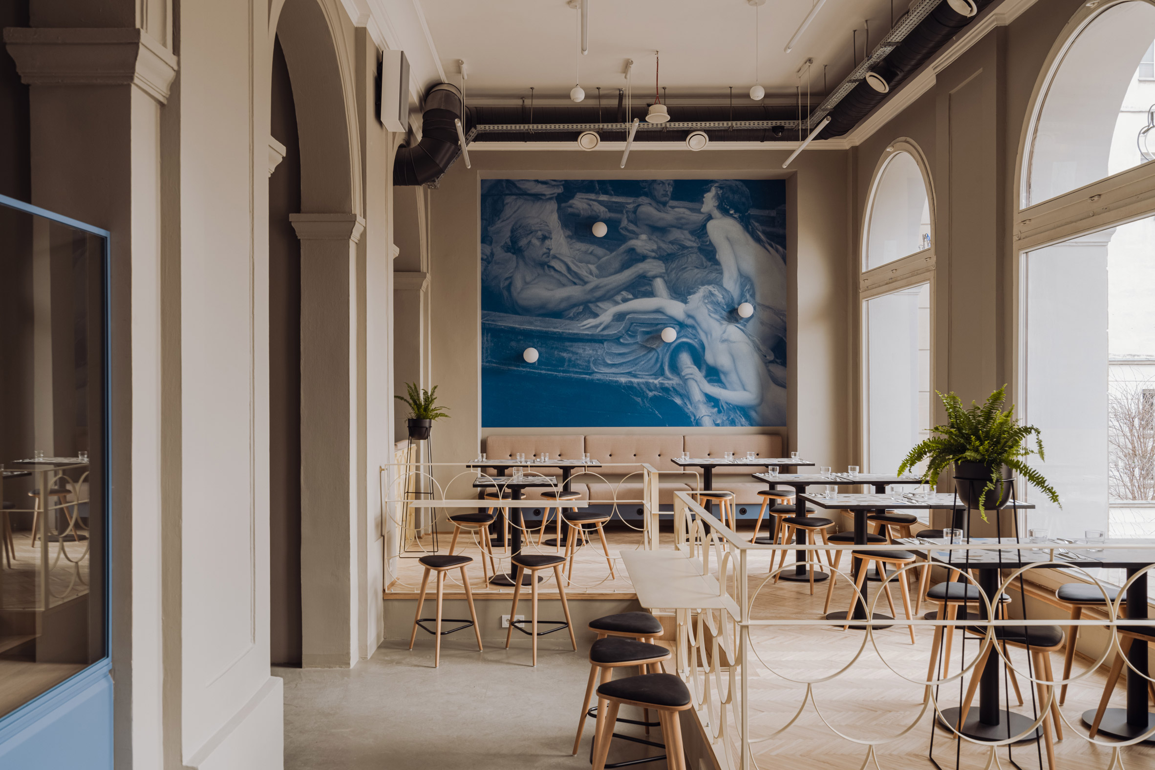
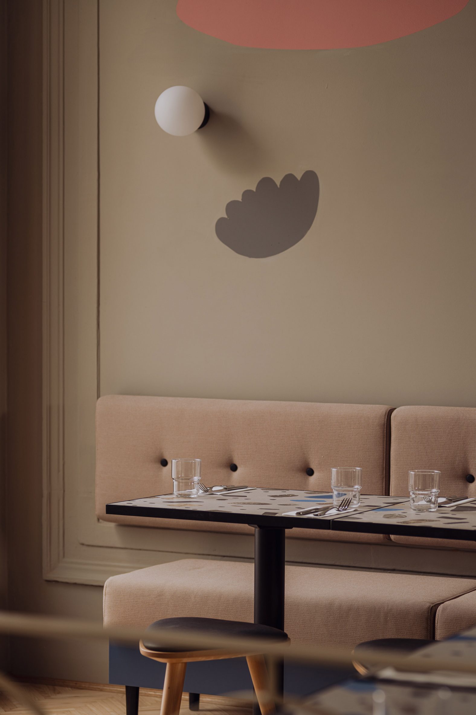
These include terrazzo-style tabletops, mosaic tiles, neon signs, milky glass sconces from Polish lighting brand Aqform and wooden stools with triangular seats by Wroclaw-based Buck Studio.
In particular, Projekt Praga said it chose details, shapes and materials associated with the “prudent design” of Poland’s communist era.
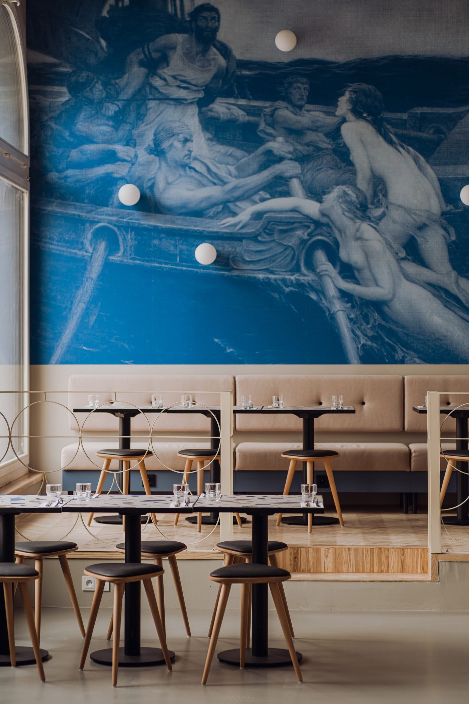
The terrazzo-style tabletops with their simple black bases were custom made, as were most of the metal elements in the space.
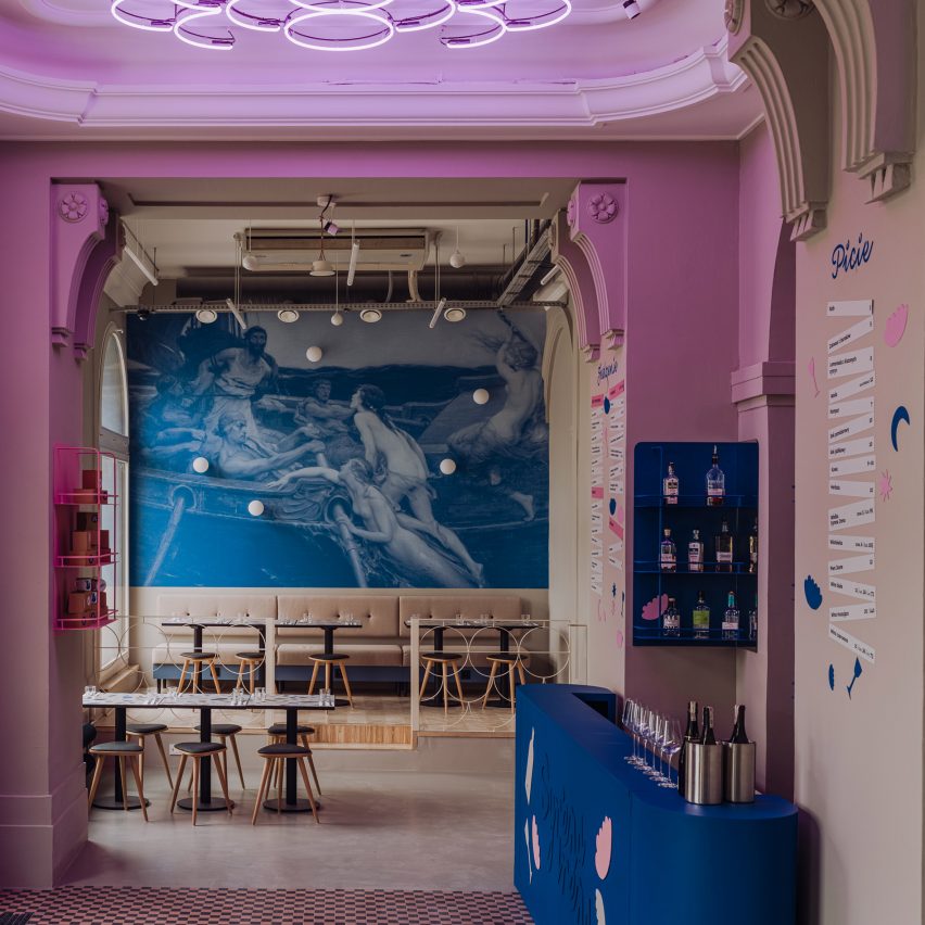
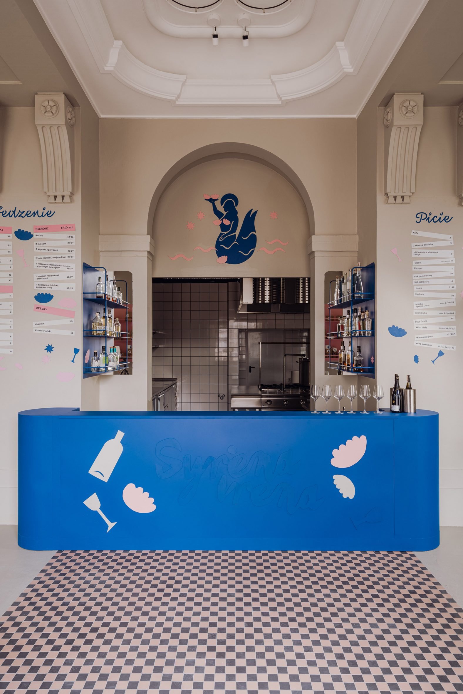
Bar counters were powder-coated in bold colours to complement the building’s original 1950s wall mouldings and arches.
A large window at the front of the restaurant allows passersby to observe the chefs at work – kneading, stuffing and folding the pierogi.
In the afternoon, sun shines through the windows and illuminates the dining room, while neon lights bring the space to life in the evening.
The colour scheme mixes aquatic blue with pink, peach and coral tones in line with the restaurant’s mermaid-themed branding, which was developed by Polish graphic design agency Mamastudio and illustrator Ola Sadownik.
Both this and the restaurant’s name, Syrena Irena, are a nod to Syrenka Warszawska – the mermaid that acts as a symbol for the city of Warsaw and can be found in its coat of arms, as well as on monuments and buildings throughout the capital.
“The alternating personality of Syrena Irena gave us a chance to use geometrical forms and colours,” explained Projekt Praga.
“The classical aesthetic of the existing space was balanced by less profound features like wall drawings, railings imitating a mermaid scale pattern and distinctive neon signs,” the studio added.
“Despite this duality in the bistro’s persona, varied details like neon signs, lettering and murals all come together harmoniously.”
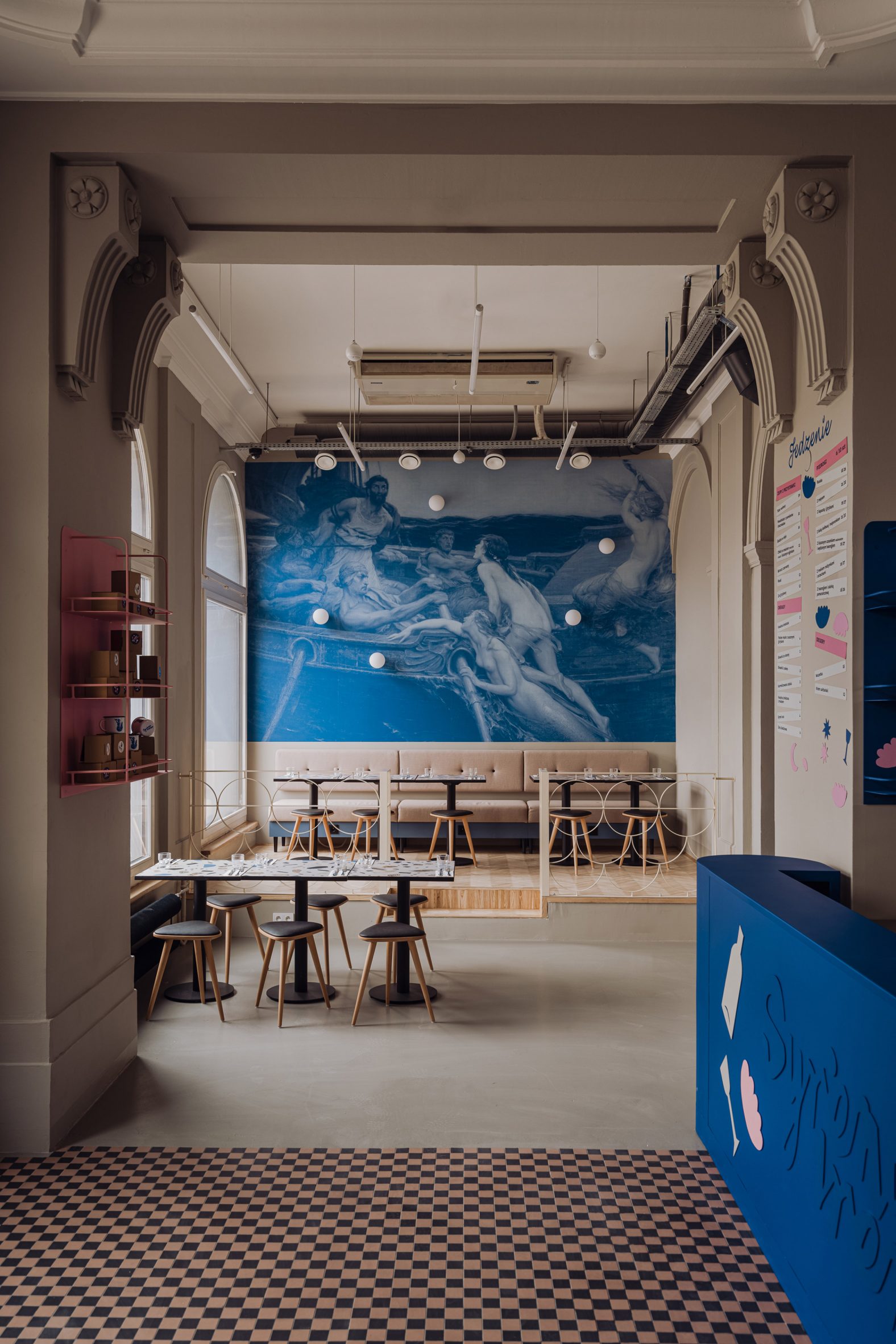
At Mamastudio’s suggestion, Projekt Praga used a monochrome print of Ulysses and the Sirens – an oil painting created by English artist Herbert James Draper in 1909 – to cover two of the walls.
The restaurant’s illuminated signeage was designed in collaboration with local artisan Jacek Hanak, who is responsible for reviving many of the city’s old neon lights.
“We were influenced by the aesthetics of the jazzy Warsaw of the 1960s when this part of town was a vibrant destination for night owls and barflies,” said Mamastudio of the restaurant’s branding.
“There were bright neon signs, music was everywhere, colourful artsy types and thrilling energy. With that, we decided that the mermaid logo should bear resemblance to a retro cut-out. The typography is expressive and slightly clumsy on purpose.”
Other dumpling restaurants featured on Dezeen include a bao restaurant in Valencia that was designed to resemble a sunset and a small Chinese eatery in New York, where stainless steel, brass and polycarbonate are combined to create a futuristic interior.
The photography is by PION studio unless otherwise stated.
The post Projekt Praga incorporates mid-century references into Polish dumpling restaurant appeared first on Dezeen.